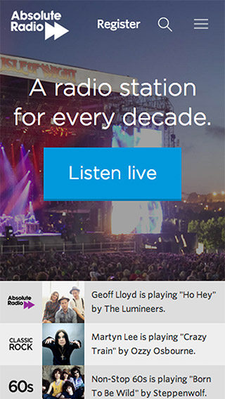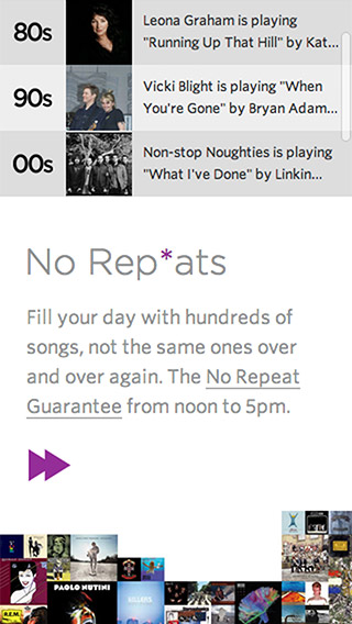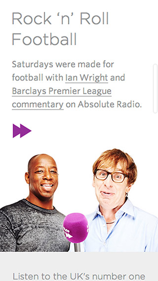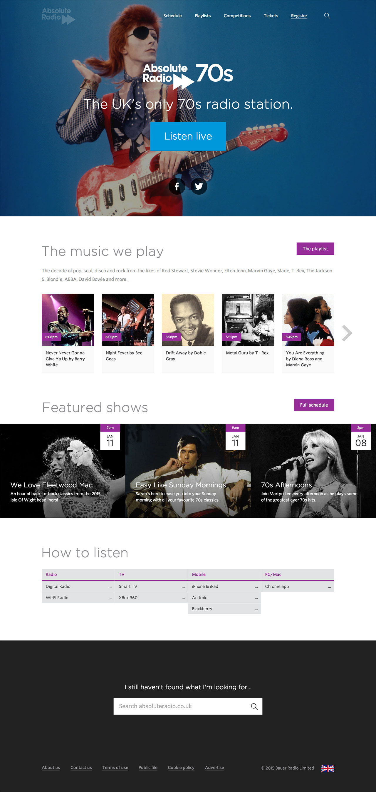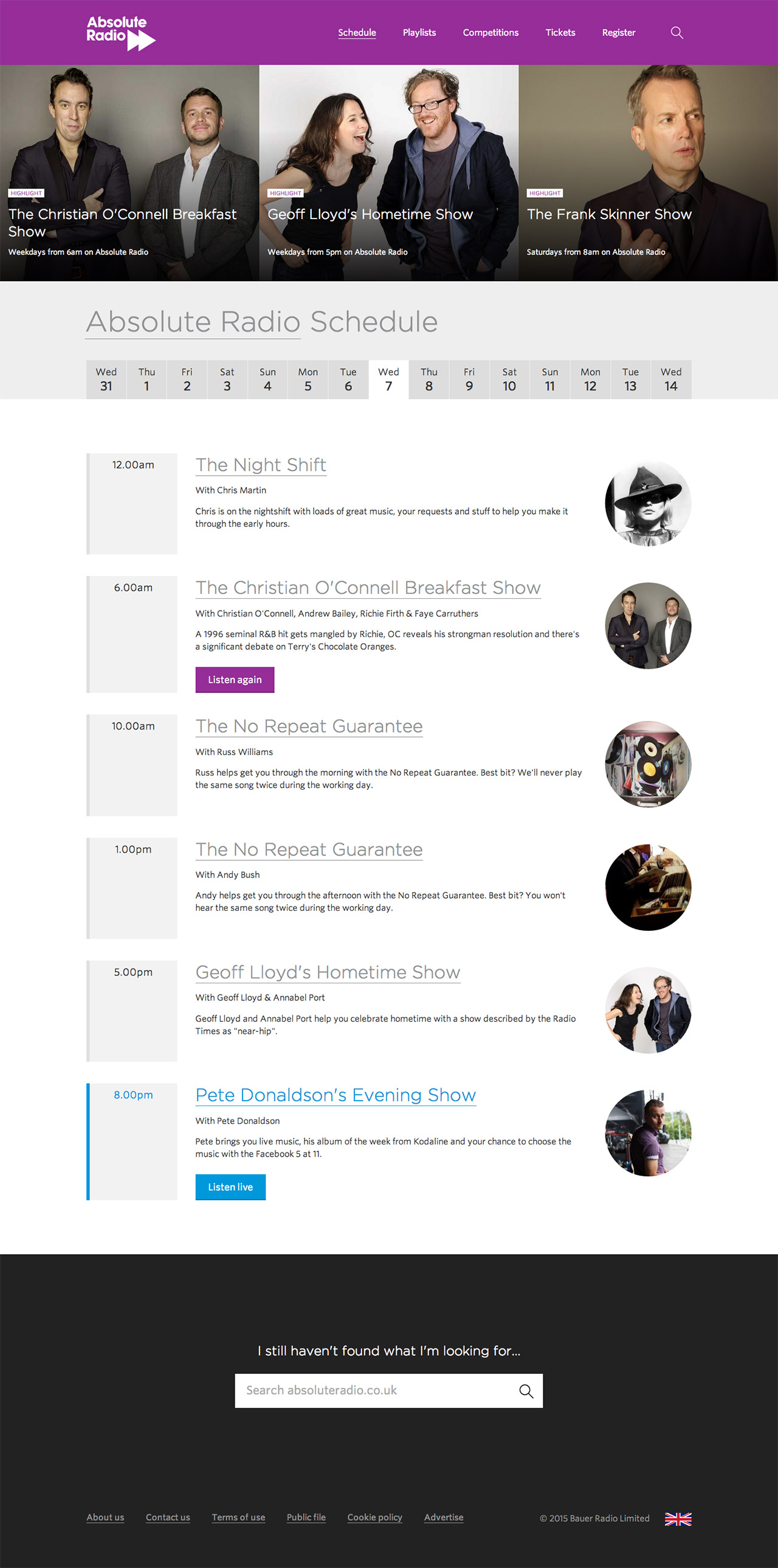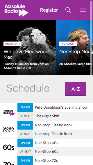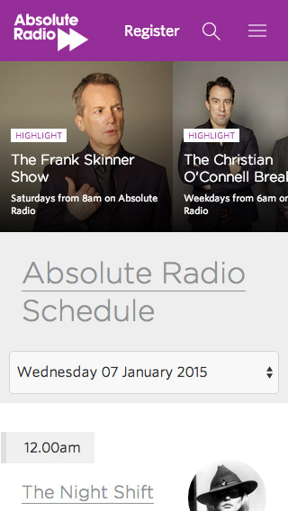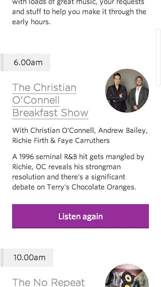
Absolute Radio
Responsive website for national music & entertainment brand.
Background
Absolute Radio’s web strategy had remained consistent since Absolute Radio launched in 2008, when Virgin Radio’s website was re-skinned and re-branded. Much of absoluteradio.co.uk’s site structure, layout and content management system could all be traced back across gradual evolution that spanned a ten year period.
The Brief
The main business case was to get new users to trial the radio station, for existing users to be able to listen to the radio station they want quickly and easily and to create more listening occasions and appointments to listen.
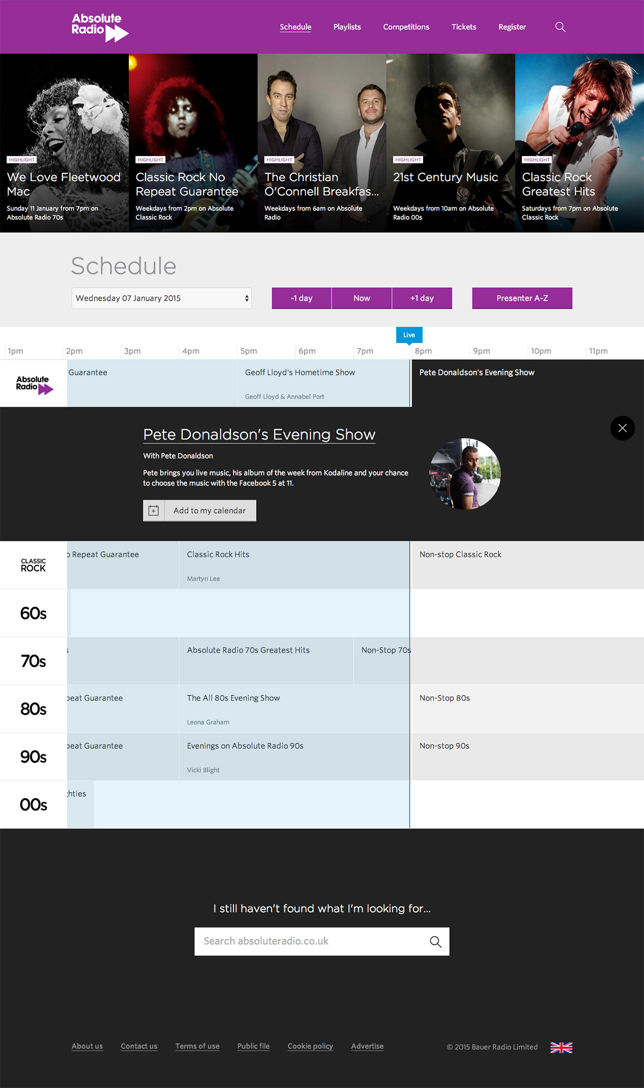
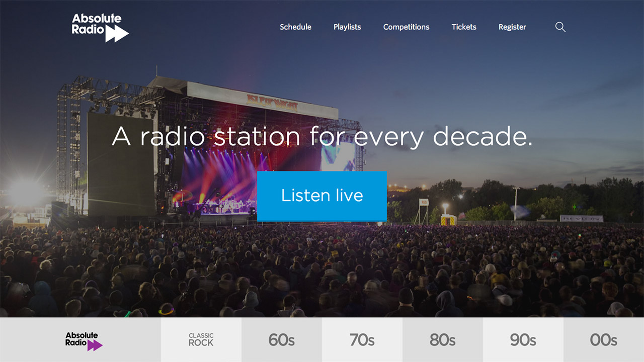
The separate Absolute Radio station websites were to be consolidated to one site under the network premise of “A radio station for every decade” and allow users to see what’s on across all services.
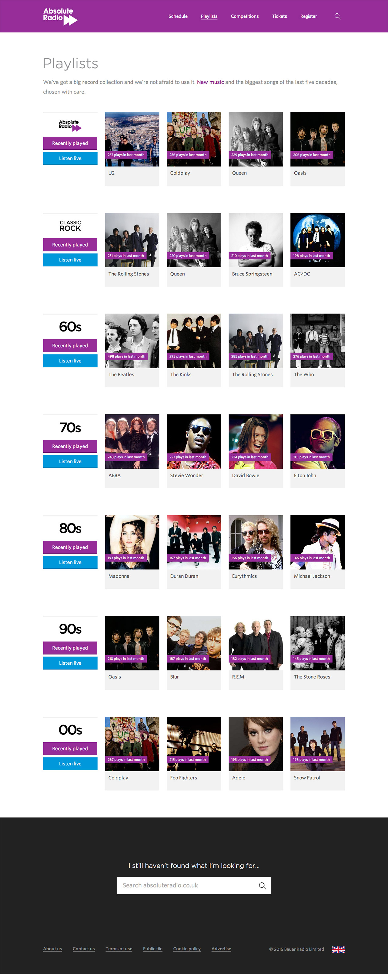
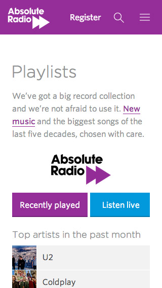
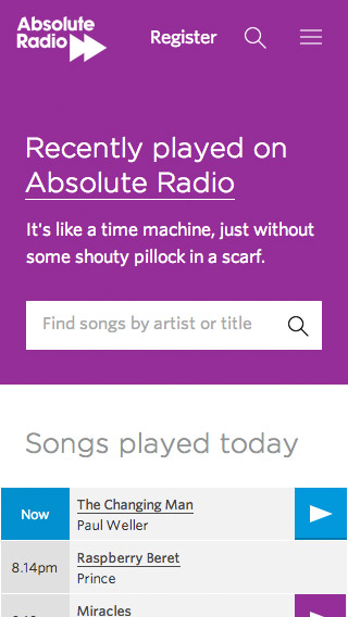
An evolution of the Absolute Radio visual brand style for the main station and across all stations in the network was also needed. As was the creation of a new interface style and new responsive page templates.
Defining the overall user experience
I worked in collaboration with the Product Director, Content Director, Development and Design Teams to establish the overall user experience.
The key business need was to persuade new users to trial the radio station and existing users to easily find and listen to the radio station they wanted. That meant the website would need be smart enough to provide users with the best way to listen on their current device, it would need to detect the device being used and present users with the best journey to listening, making trial frictionless.
We decided we would need to be able to offer slightly different experiences depending on the type of user. For example, on the homepage new visitors would be able to quickly find out about Absolute Radio and get straight to trial, while users logged-in to their accounts would get listening recommendations and fast access to their favourite station.
We wanted to replace the multi level navigation structure with a more fluid approach that would allow for more tactical promotion of content. A more intelligent search box would allow the user to find content across the Absolute Radio website and beyond, also returning results from external sites such as YouTube. Taking its cue from Apple’s Spotlight search, results would be ordered by type, making it easy to find live, upcoming and on-demand content.
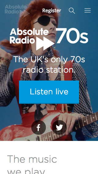
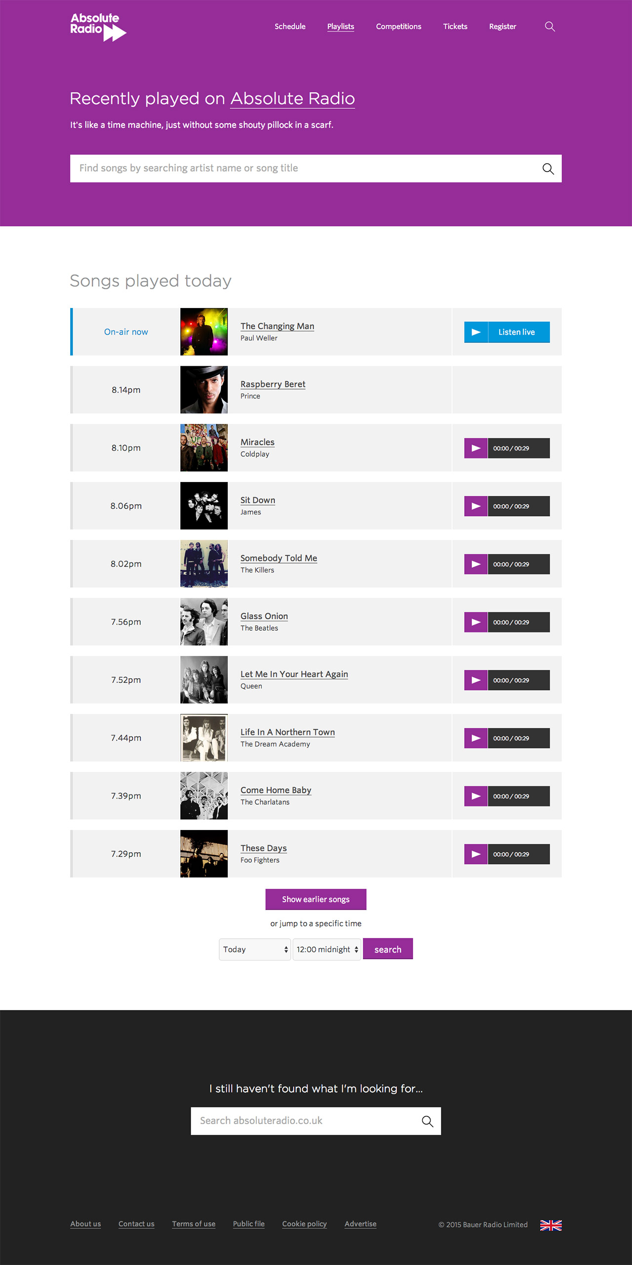
A unique “Listen Live” button would be created to stand out against all other elements on a page which, when activated, opened the web player and started the radio stream. This button would be placed strategically across the site to encourage listening at every relevant opportunity.
Evolving the visual style
I collaborated with the Brand Manager, Product Director, Marketing Director and Design Team to lead the evolution of the visual style.
I used the wireframes for the homepage and episode page, iterating newer versions of each page based on suggestions and feedback from the team. Once we reached a consensus on the overall look and feel I started rolling out a consistent visual style across the other page templates, tweaking as more feedback arrived.
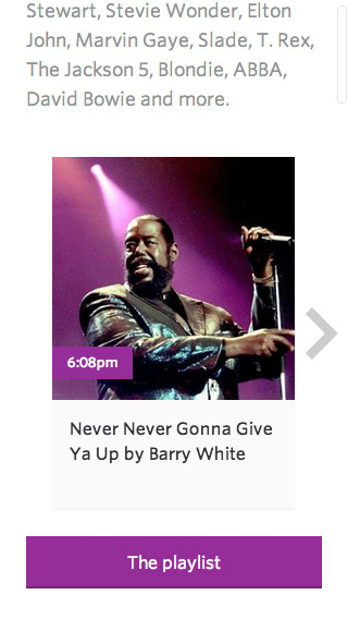
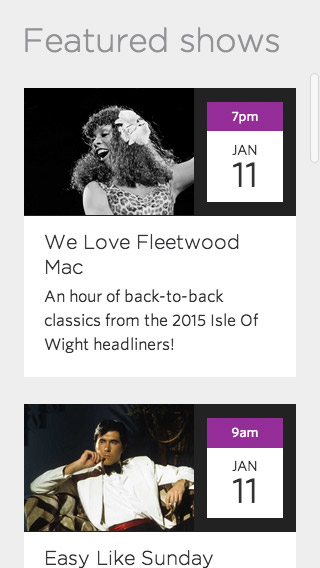
The main stylistic decisions were to change our use of Gotham for titles from a bold to a much lighter weight to give a more modern look. I paired it with Whitney (also from typography.com) for body copy. We moved away from using textures and patterns to differentiate between stations and started using iconic imagery to instead convey era, style and flavour of each station’s output.
We used the Absolute Radio purple to help pull out highlights such as interaction points and other key information within each page.
Technical delivery
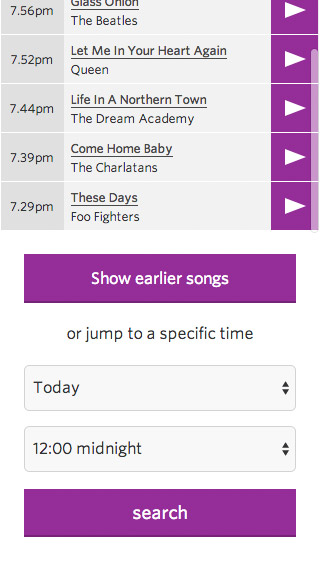
I supplied full visual designs for the core pages (homepage, station homepage, playlist, recently played, schedule, registration, account management, show and episode), the remaining page templates (presenter, tickets, win, listen, legal & about) were designed by designers in my team, under my direction.
I built the main base template of the site in HTML, CSS and Javascript. This template was then used by other front-end developers as a starting point to build each of the remaining page templates under my direction. I also built the sign up and account management pages using this template.

